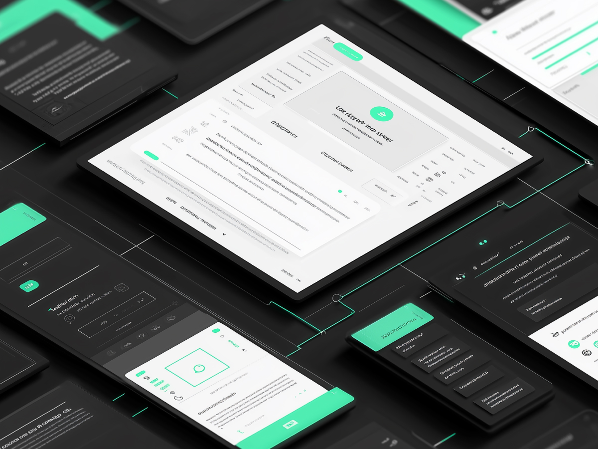
Visual and interactive elements of digital interfaces
User Interface (UI) design is the linchpin between people and digital experiences. It’s what users see and interact with—buttons, icons, color schemes, typography, menus, and animations. It’s means guiding the user through intentional, functional interactions. If users don’t understand how to use your platform, or worse, are frustrated by it, you lose them. They don’t care about your tech stack or roadmap. They care that it works fast and feels easy.
A strong UI makes that possible. It’s the skin and nervous system of digital products. Whether it’s a web app, a voice interface, or the dashboard on a smart device, UI controls how users engage and how confident they feel using it. The job isn’t just design, that’s misleading. It’s behavior engineering. UI designers think through how humans behave, what they expect to happen when they click, swipe, or speak. Then they build that behavior into the screen.
This isn’t optional if you’re aiming to scale. User frustration doesn’t scale well. When your product delivers clean, intuitive UI, you reduce activation time, cut support costs, and increase retention.
Visually, good UI aligns with your brand message and quality standards. Bad visual design communicates chaos and confusion. It doesn’t matter how good the product is under the hood, if the UI breaks trust, the user won’t continue.
One more thing, don’t confuse UI with UX (User Experience). UX is the big picture, everything from market fit to feature logic. UI is how each part of that experience comes alive in the actual interface. You need both.
According to industry benchmarks, digital platforms with strong UI design improve customer satisfaction by up to 30%. That translates to real financial upside, improved loyalty, reduced churn, and a shorter conversion timeline. Ignore that, and your product becomes noise.
So, UI matters. Function drives preference, and great UI sharpens that function. If your executive team isn’t allocating the right resources into UI design now, it’s already behind.
UI and UX design serve distinct but complementary roles
Start by understanding a basic truth: UI and UX are not interchangeable terms. Many teams still confuse them, yet they solve different problems. Executives who don’t understand this end up funding the wrong talent or misjudging product readiness. Let’s fix this.
UX, User Experience, is the foundational layer. It’s about understanding users deeply. UX designers analyze user behavior, conduct interviews, map journeys, and identify friction. Their focus is the structure: What features should exist? What problem are they solving? Where do users drop off and why? UX figures out the logic and flow before a single pixel is designed.
UI, User Interface, is the surface where that logic becomes real. Once UX has defined the journey, UI designers step in to create the screens and interactions users will actually touch. That means choosing typography, color systems, button structures, the placement of interactive elements, anything the user clicks, taps, or reads. UI’s job is to make the user experience functional and visually engaging.
The relationship is sequential and collaborative. You can’t execute interface design correctly without UX inputs. And you won’t see the ROI of UX until UI delivers it in a functional product. Great products come from strong alignment between these two disciplines. That alignment is operational, not theoretical.
Executives should care about this division because misalignment between teams slows down development and hurts customer experience. When your teams treat UI and UX as a bundle instead of coordinated functions, design debt grows fast. Feature delivery stalls. Internal discussions start focusing on subjective opinions instead of user-centered results.
Here’s what the data tells us. According to a 2022 report by Forrester Research, companies that improved both UI and UX in tandem saw up to a 20% increase in user conversion rates. That’s a business impact rooted in design clarity.
It’s also worth noting that both functions require different skill sets. UX design leans analytical, user flows, wireframes, data validation. UI leans visual and interactive, style guides, visual hierarchy, motion. When hiring, don’t look for unicorns who do both perfectly. Build a team that collaborates effectively. That’s faster. That’s scalable. That’s what wins.
The UI design process follows a structured sequence
If you’re serious about product speed and scale, your UI design process cannot be a guessing game. A structured workflow, executed by people who know how to ship, reduces friction in development and keeps teams aligned. UI design isn’t about following creative instinct. It’s a methodical, decision-driven path from insight to implementation.
It starts with research, understanding who you’re designing for. From there, designers and product teams move into wireframing, where decisions are made about interface structure. These blueprints guide prototyping, where real interaction behavior gets tested, not just imagined. After that comes visual design. This isn’t the stage where UI becomes “pretty.” It’s where visual language is aligned with brand identity, accessibility standards, and user expectations.
Then you enter usability testing. This is where you eliminate the false assumptions. Feedback from real users highlights whether the interface makes sense, whether users can complete tasks, or whether the journey breaks down. Iteration follows. That’s non-negotiable. You don’t ship after the first version, you iterate until the friction disappears.
Finally, there’s development handoff. At this stage, designers share specifications and prototypes with engineers. It only succeeds if documentation is precise and collaboration is active. If your UI and engineering teams aren’t closely communicating here, you’re going to create avoidable bugs, miss timelines, and burn more QA hours than necessary.
C-suite leaders should take this process seriously. A broken process here creates compound inefficiencies later, especially post-launch. Treat it with the same importance you’d give to backend architecture or data pipeline planning.
According to a McKinsey report, companies that adopt structured, iterative digital design processes can reduce project time and costs by up to 25%.
If your product and design teams aren’t working inside a disciplined design process, you’re funding waste. The absence of structure has a cost, it’s not immediately visible on the balance sheet, but it hits hard when user retention drops, NPS sinks, or a redesign becomes mandatory right after launch.
User research is key to creating effective UI designs
Designing a product without user research is a strategic blind spot. You’re designing based on internal assumptions—not reality. If your team doesn’t understand the user, the interface won’t serve them. That disconnect eventually hits your metrics: higher abandonment, more support tickets, slower adoption.
User research gives teams the data to design with precision. That means direct insights from qualitative and quantitative methods: interviews, surveys, usability tests, and behavioral metrics. It’s about knowing what frustrates your users, what motivates them, and where they drop off. Research answers questions that design alone can’t solve.
This phase depends on aligning design with actual user needs. For example, understanding whether your core users are task-driven or exploration-driven immediately impacts how you prioritize UI elements and layout decisions. Without this context, interface decisions become guesswork, and guesswork doesn’t scale.
C-suite leaders should demand user research as part of every product initiative. It derisks investment by ensuring the product direction is validated before development begins. In enterprise environments, it also builds internal stakeholder confidence. You’re no longer trying to convince colleagues based on taste or opinion. The data does the work.
Research also plays a critical role in accessibility. If your user base includes people with vision, motor, or cognitive challenges, and it does, whether you know it or not, your team needs to validate that the UI doesn’t unintentionally exclude them.
According to the Nielsen Norman Group, products shaped by continuous user research see up to a 40% increase in usability, meaning clearer workflows, faster task completion, and lower support costs.
Bottom line: user research is an investment in proactive design. Without it, your team is guessing. With it, you design for outcomes, and no executive should settle for anything less.
Wireframes and prototypes serve as planning and validation tools
Wireframes and prototypes aren’t optional steps. They’re essential instruments for reducing risk, aligning stakeholders, and ensuring your product is built right before you write code. If you’re skipping this phase, or rushing through it, then you’re inviting inefficiency into both your design process and development cycles.
Wireframes give the team structural clarity. They define the layout, information hierarchy, UI components, and functionality at a skeletal level. At this point, visual aesthetics are not the focus. The wireframe maps what will be on the interface, where it goes, and how a user moves from screen to screen. It allows early feedback, identifies potential design friction, and surfaces gaps in user flow.
Once the wireframe is aligned internally and cleared for usability, your team should move to prototypes. This is the point where the product becomes interactive. Clickable prototypes simulate how users engage with the final interface. You’re testing structure, behavior, responsiveness, and system feedback. This is the last checkpoint before development resources are committed.
Stakeholders need prototypes to verify design decisions. Engineers need them to estimate build time accurately. User testers need them to provide feedback that’s grounded in actual use, not conceptual assumptions. And your design team needs them to fix usability issues before writing handoff docs.
Executives should care because this phase controls downstream operational cost. Editing a prototype takes minutes. Fixing a feature after it’s shipped takes weeks and burns cross-disciplinary effort. This is where you protect your product timeline and budget.
Best-in-class teams use tools like Figma, Sketch, and Adobe XD to accelerate iteration. These tools support real-time collaboration across design and engineering, which speeds up decision-making and increases accountability.
Research from the Design Management Institute found that investing in early prototyping can reduce development costs by up to 30%.
If your design and product teams are pushing features into development without full wireframe and prototype validation, they’re compressing your timeline short-term only to inflate your rework later. Don’t let that pass for velocity. It erodes long-term scale.
Designing visual elements is central to both functionality and brand expression
Visual design isn’t there to “impress.” It’s there to execute. Every color, icon, button, and typographic choice supports either usability or clarity. If not, it’s wasted design. Your interface should tell users what to do, where to focus, and how to move through the experience without requiring explanation.
UI designers manage both the visual integrity and functional clarity of a product. That means selecting iconography that communicates without ambiguity, spacing that supports focus, color systems that clarify actions, and typography that aligns with tone and utility. Nothing is arbitrary. Every visual choice affects the pace, emotion, and behavior associated with each screen.
At the same time, these elements define how users perceive your brand. You’re showing them how consistent, trustworthy, and high-quality your product is. Visuals create immediate trust signals. When design quality drops, confidence drops. The user doesn’t distinguish between UI inconsistency and product failure. It’s all the same to them.
Design should also adapt across devices and platforms without breaking. If your brand visuals work on desktop but collapse on mobile, the problem is lack of adaptive visual strategy. That’s a red flag for any executive expecting product scale.
Visual design is also strongly tied to accessibility. Poor contrast, text sizing issues, or confusing button shapes reduce aesthetic quality and exclude users.
According to Adobe’s 2022 Digital Economy Index, companies that prioritize cohesive and functional visual design gain up to 50% more market share over those that overlook it. Customers trust what they can easily use, especially when it looks consistent and polished.
Visual design serves two jobs simultaneously, guiding user interaction and reinforcing brand perception. When executed well, it becomes invisible in the best way, it supports the experience without needing user attention. When executed poorly, it becomes a blocker. As a leader, don’t treat visual design as subjective. It’s a measurable performance asset.
Usability testing and iteration are vital for refining user interface effectiveness
Usability testing is a key system for identifying where your interface fails to communicate, guide, or respond effectively. You might have strong visuals, fast performance, and clean architecture, but if users get stuck, none of it matters.
Testing reveals system friction that internal teams usually miss. That’s because creators know how a product should work. Real users don’t—they only judge what’s in front of them. Their failures to complete basic actions aren’t incompetence. They’re signals. At scale, these failures cost you growth, time, and reputation. Usability testing catches them before they hit your metrics.
It’s not a one-off task. Testing must be built into the cycle. As your product evolves, so do its user flows. Every feature or major change requires validation. Preferably through structured tasks and open feedback loops. Measure what matters—task success rate, time to completion, abandonment points. Then feed those insights directly into iterative design updates. That’s how you shape a UI that responds to real usage, not internal opinions.
From a leadership standpoint, this process protects product-market fit. No executive should endorse a product update without clear user feedback on its effect. Even well-intended features can introduce confusion. You want rapid identification, low cost of recovery, and minimal disruption. Usability testing makes that possible. Iteration makes sure those insights aren’t ignored.
UI design doesn’t stop when a prototype is approved. It ends when repeated testing reveals minimal user friction across critical tasks. That’s when velocity becomes sustainable.
According to a 2021 study by UserTesting, iterative usability testing reduced user errors by as much as 33%, while also increasing task success rates by over 20%.
If you’re not building iteration into your design cycles, you’re scaling up problems. They will re-emerge in support tickets, customer churn, NPS drops, and redesign debt. Executives should push for testing infrastructure early. It’s cheaper than recovery and far more strategic.
Fundamental principles of UI design
The most effective UI design doesn’t start with visuals, it starts with intent. It’s built around user-centered thinking. Every component must serve a user goal. If it doesn’t, it’s unnecessary. UI design, at its core, is about removing friction, not adding decoration.
User-centered means anticipating user needs and behaviors, then structuring the interface so users can instinctively understand what to do. This doesn’t happen by chance, it’s the result of deliberate prioritization, task simplification, and clarity in hierarchy. Users shouldn’t have to think too hard to figure out what to click, where to look, or how to navigate.
Aesthetic usability is about more than making screens attractive. It’s about using design to reinforce clarity. Research shows users often perceive better-looking interfaces as more usable, even when the actual functionality is equivalent. This doesn’t excuse ineffective functionality. It emphasizes that visual design contributes directly to the user’s perception of quality, ease, and reliability.
Accessibility is non-negotiable. If you’re ignoring it, you’re excluding users and violating emerging standards in corporate responsibility, and in some markets, regulatory compliance. Design must work across vision, mobility, and cognitive ability spectrums. That includes sufficient contrast, font legibility, scalable layouts, and clear identifiers for interactive elements.
These principles support each other. Products that prioritize them consistently score higher on usability, customer satisfaction, and system efficiency. They also require cross-functional alignment, engineering, design, and leadership must all treat them as priorities, not edge-case considerations.
For executives, this comes down to strategy. UI principles are measurable tactics. Improved usability reduces support costs, increases adoption, and scales retention. Ignoring these fundamentals because of timelines or aesthetic preference will create more problems than it solves.
The World Health Organization estimates that over 1 billion people live with some form of disability. That’s a significant user segment with real purchasing power. If your UI blocks access, you’re shrinking your addressable market, and damaging brand perception.
Consistency across UI elements strengthens usability and user familiarity
Consistency is one of the most straightforward principles in UI design, but it’s also one of the most overlooked. When applied correctly, it eliminates confusion, accelerates user actions, and reduces the amount of thought required to navigate an interface. When applied poorly, or not at all, it increases friction, slows onboarding, and diminishes trust in the product.
Consistent UI means your buttons behave the same way across screens. It means typography follows a defined system. It means clickable elements are styled identically. Your color palette doesn’t shift arbitrarily. The user learns how things function once, and that knowledge transfers across the rest of the experience. That’s what drives confidence in usage, especially for first-time or infrequent users.
From an operational perspective, design consistency pays off fast. It reduces the volume of explainers, help requests, and documentation glitches. It also accelerates development cycles since designers and engineers follow a shared design system that doesn’t need to be rebuilt screen by screen. The net productivity boost across cross-functional teams is measurable.
C-suite leaders should view consistency as a scalable asset. It supports usability today and strengthens enterprise-wide design efficiency over time. As your product grows, adding more features, screens, international support, or new device types, design consistency makes sure you’re not compounding complexity with every update.
It’s also central to brand perception. Consistency reinforces brand tone and polish. If your product interface lacks cohesion, users notice. And they associate inconsistency with lack of quality control. It affects brand equity and user confidence, particularly in competitive markets where the alternative is one tap away.
According to research from the Interaction Design Foundation, designing with consistency can reduce task completion time by up to 20%. That’s a clear performance metric that impacts any measurable user activity, shopping, booking, onboarding, configuration, or navigation.
Consistency in UI means creating reliability across touchpoints. Products that deliver consistency are easier to use, faster to learn, and more trusted, all outcomes that directly support your business performance.
Providing interactive feedback improves user control and engagement
Every digital interaction must return a clear result, visually, audibly, or through changes on the screen. If users click or swipe and get no response, the assumption is failure. That increases frustration and breaks flow. UI feedback is how we close the loop between user action and system acknowledgment. It’s non-negotiable.
When feedback is implemented correctly, users understand immediately whether they triggered the right function. A visual cue, like a pressed button or a loading indicator, confirms their input was received. A message confirms a setting was saved. A subtle animation signals a transition. These details reduce second-guessing and hesitation. The result is faster interactions and higher task completion.
For complex systems, especially multi-step tasks, feedback also reduces support dependency. It gives users the confidence to proceed, knowing they are on the right track. If something fails, clear error messages with specific actions allow quick recovery. Silent errors or vague alerts only increase abandonment and churn.
Consistency in feedback matters. If one part of your system provides real-time confirmation and another doesn’t, users don’t trust either. They don’t want to relearn interactions between screens or functions. That weakens the experience and creates internal tension across product releases.
From a business standpoint, this has direct impact. Clear feedback loops reduce time-to-completion, lower support center load, and increase customer satisfaction. More importantly, they contribute to retention—because users stay where the product behaves predictably.
According to Forrester Research (2020), well-implemented UI feedback mechanisms can increase user engagement by approximately 28%
Leadership should ensure UI feedback is not treated as an afterthought in product design. It is core functionality, not “finishing touches.” Without it, the interface leaves users disconnected from system behavior. With it, the experience improves immediately. It’s a design layer that supports trust, control, and continued use, three levers that drive real business value.
Accessibility is a fundamental responsibility of UI design
Accessibility must be a baseline requirement. If your product isn’t usable by people with disabilities, it’s incomplete, and legally vulnerable. It also leaves out a sizeable share of your potential market.
Designing for accessibility means considering people with vision impairments, cognitive limitations, mobility restrictions, and hearing conditions. That requires clarity in interface elements, readable fonts, high-contrast color schemes, screen-reader compatibility, keyboard navigation, and clear labeling. These aren’t specialist concerns, they are structural decisions that should be embedded in the design process from day one.
Accessible design also improves general usability. Features like larger touch targets or text that resizes benefit everyone, not just specific user groups. It’s a leveraged investment. And in many jurisdictions, failing to hit accessibility standards—such as WCAG (Web Content Accessibility Guidelines), carries regulatory and legal risk. That risk increases as more countries tighten enforcement.
Designers should treat accessibility as a shared responsibility, not something to be “checked” at the end. It links directly with design system standards, testing protocols, and engineering implementation. And your leadership team should be enabling the right infrastructure, budget, tools, training, and quality control cycles, to support it.
More importantly, it sends a clear message to users: we recognize your needs, and we built for you. That builds loyalty, differentiates your product, and improves the corporate brand.
Accessibility is a requirement with direct commercial implications. Products that are accessible reach more users, reduce customer support volume, score higher in audits, and align with modern corporate responsibility standards. If your team isn’t already prioritizing it, fix that. It should be built into process, tooling, and leadership accountability.
A mix of technical and interpersonal skills is key for UI design
UI design sits at the intersection of design, engineering, strategy, and product. To perform in this role, technical ability alone isn’t enough. Designers need to execute with high visual and functional precision, but just as importantly, they need to work effectively with other disciplines and stakeholders across the organization.
From a technical standpoint, UI designers must be fluent in design tools like Figma, Adobe XD, and Sketch. They also need a strong grasp of typography, color theory, spacing systems, and component logic. They allow design to scale and remain coherent across multiple platforms and user states. Without them, even good ideas fall apart in execution.
Interpersonal skills matter just as much. UI designers operate in teams where cross-functional communication is constant. They translate complex UX data into actionable screen-level solutions. They present work in product reviews, align with engineers on implementation constraints, guide QA on interaction behavior, and work with marketing teams to ensure design continuity in external communication.
If they can’t communicate ideas clearly and defend their decisions, they slow down decision-making. If they can’t collaborate, they lose track of engineering realities or violate UX logic. These gaps are avoidable when communication and problem-solving are prioritized alongside technical output.
For executives, hiring or developing UI talent with both sets of skills is a performance multiplier. It reduces design silos. It enables faster iteration. It strengthens collaboration between design and development. And it makes handoffs cleaner and more efficient.
According to Deloitte Digital (2021), teams with strong cross-functional design skills are up to 35% more efficient in delivering projects on time, without compromising quality.
You don’t need unicorns. You need adaptable, skilled designers who can move between execution and communication with consistency. Prioritize that when hiring. Invest in it through training. If you want product velocity and interface quality, your design talent needs both disciplines. Technical craft and professional fluency, non-negotiable.
UI design offers strong career prospects
UI design is not a niche. It’s a key function within digital product teams, and demand for experienced designers continues to grow across industries. As companies expand their digital ecosystems, across apps, web platforms, smart devices, and internal tools, the need for skilled UI professionals is scaling with it.
Careers in UI design are well-compensated. The average salary currently sits around $75,057 annually. Junior-level roles typically start near $60,000, mid-level roles are around $100,000, and senior designers earn up to $134,750 per year. These numbers reflect more than market demand, they reflect the value these professionals bring to product success, user retention, and brand consistency.
Career progression is also structured. Designers move from entry-level roles to mid-weight, then to senior and lead positions. At higher levels, they may transition into specialized roles such as UI system architect, product design lead, or design director. Many also shift laterally into UX strategy, product ownership, or creative leadership, depending on business needs and individual strengths.
Beyond compensation and job titles, UI designers are becoming strategically valuable. Companies increasingly recognize that great interface design drives conversion, reduces support costs, and raises the perceived quality of the product. Leadership teams now look to design for input on roadmap priorities, user risk, and brand expression. That means designers who understand both craft and impact will have clear seats at the table.
For executives building or scaling teams, this is the moment to invest. When UI designers are brought into planning early and given the space to own their process, the outcome is fewer reworks, better user metrics, and stronger product-market alignment.
There’s also the AI factor. While AI tools are now capable of suggesting layouts and automating design variations, they don’t replace critical human context, motivation, nuance in behavior, emotional resonance. That core skill set remains uniquely human. For all of AI’s utility in speeding up design operations, it still depends on human-defined standards and interaction models.
Skilled UI designers are strategic assets. Their ability to balance user interaction, brand identity, and system structure makes them essential in long-term product success. Retaining and developing this talent is a competitive advantage. Period.
Multiple pathways exist for entering and growing within the UI design field
UI design isn’t locked behind a single credential or degree. There’s no one entry point, and that’s an advantage, for both aspiring designers and the companies hiring them. Whether someone enters through a formal education, a bootcamp, or self-learning, what matters is capability, execution, and the ability to think in terms of user behavior.
University programs offer structure. Degrees in Human-Computer Interaction, Digital Design, Interaction Design, or Human-Centered Computing provide a theoretical and technical foundation. These programs introduce usability frameworks, accessibility regulations, and visual communication at scale.
Bootcamps offer high-intensity training. They’re optimized for skill acquisition and portfolio development. The better ones simulate real-world design sprints, focus on feedback cycles, and support job placement. They compress several months of learning into a few focused weeks and often suit career switchers or professionals seeking fast reentry into the market.
Self-learning requires more discipline but is accessible. Free and paid UI courses, case study breakdowns, design systems, and challenge platforms are widely available. Designers can now learn through real-time feedback on platforms like Dribbble, Behance, and Figma Community. Paired with open-source contributions or freelance work, self-learners often build impressive, practical portfolios.
What matters to employers is not how you learned, but what you can deliver. Strong portfolios are non-negotiable. They need to show interface decisions, process thinking, and real user outcomes, not just screens with polished visuals. Internships, volunteer work, and side projects are valid ways to build that. Real-world validation is more powerful than certificates.
For executives and hiring leads, this means broadening the evaluation criteria. Don’t just prioritize degrees or branded bootcamps. Focus on applied skill, problem-solving, and the designer’s ability to explain their decisions. Teams built on merit and adaptability outperform teams built on uniform backgrounds.
Networking also plays a role in UI career mobility. Connection to communities, mentors, and project-based collaborations often accelerates job access. Development of a personal website, case studies, and visibility in industry forums increases both credibility and discoverability.
In short: UI career paths are diverse, accessible, and tied directly to initiative and output. Companies that recognize this flexibility have access to wider talent pools, and are more likely to build innovative, adaptable design functions from the ground up. Smart hires don’t always follow prescribed routes. Look for what they’ve built, not just where they studied.
The bottom line
UI design is a business function. It shapes how users interact with your product, how they trust it, and whether they come back. Great UI eliminates friction, drives efficiency, and scales experience across platforms and user segments. It reduces support load, speeds up onboarding, and turns first impressions into long-term engagement.
For executives, this is about product clarity, operational speed, and market reach. Teams that prioritize UI early avoid costly rework, retain more customers, and build stronger roadmaps. The ROI is measurable. The competitive edge is real.
If product usability, brand credibility, and accessibility matter to your strategy, and they should, then UI design needs to be integrated as core infrastructure. Fund it accordingly. Build the right team. Give it a seat at the table, not just at delivery. That’s how you ship better, scale faster, and create products people actually want to use.